Today is the day! I’m very happy to share my tips for using your 3D renders with 2D backgrounds with you today. And… At the bottom of the page, I also have a gift for you to use in your art and/or photography!
This is not meant to be a tutorial. This is a sharing of a few things I have learned to do, and not do, when I use 3D renders to create my digital art. These methods work for me and the style of art I want to create. They are certainly not the only, nor necessarily, the best way to do things. Every artist will have to decide what techniques they use to create their own style of art.
The way I use Poser and/or Daz Studio to create art, is usually to render a single figure in the fastest way possible (I hate long renders!) and then take it into Photoshop and/or Paint Shop Pro to create my final piece of art by adding a background and other elements.
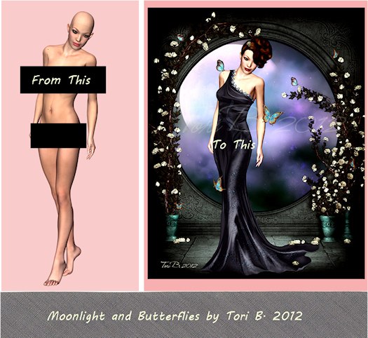
The tips I’m sharing with you, are tips on taking your single render and adding it to your background in a 2D program, so that the render does not look pasted on. We want the render to blend and work with the background to create an integrated piece of art.
- LEARN to use your 2D program (Paint Shop Pro, Photoshop etc.) and become very comfortable working with layers. This is so very important.
- DON’T get attached to your render or to the background you thought you would use. Sometimes they just won’t work together no matter what you do. You might have to pick a different background or use a different render.
- LEARN how to lighten or darken and enhance the skin tones of your renders in your 2D program using layer blending modes. It’s amazing the results you can get. This is one of the first things I do when I open my saved render in my 2D program. The image below is Blue Magic. I wanted a brighter, more magical look to my render, so I used the layer blending modes which can be found in both Photoshop and Paint Shop Pro.
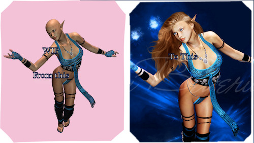
The image on the left is my render and the image on the right is a detail of my finished piece. You can see that the skin tones are very different. The original is not a bad render, but I wanted to make it more natural and alive, to make it pop.
To do this, in the 2D program of your choice, duplicate your original render twice. The bottom layer will be your original and you will do nothing to this layer.
On the first duplicate layer you will want to set your blend mode to SCREEN. For this image I left the opacity at 100% but you can change it to suit the effect you are trying to get.
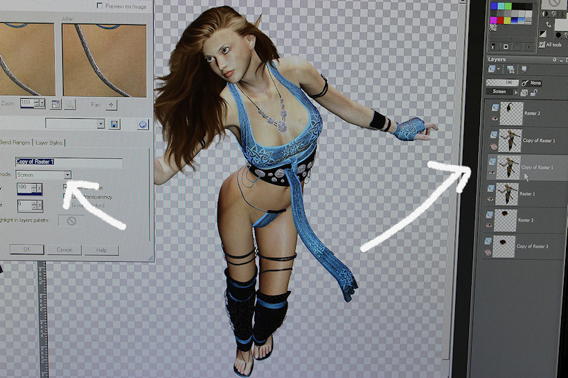
Then on the second duplicate layer, set your blend mode to SOFT LIGHT. Again, for this image I left the opacity at 100% but play with it until you get the effect you want.
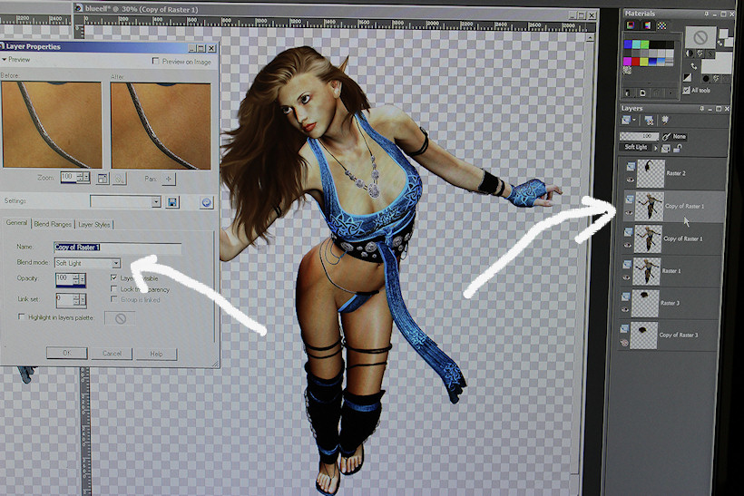
You can see the change it makes! Use this to lighten or darken your renders to suit your background.
These are the two blend modes I use most often. I will sometimes on the second duplicate layer use either, MULTIPLY, if I want a darker look, or OVERLAY, for a brighter, more saturated look. Experiment! Try different blend modes and opacities and discover what works best for you and the background and render you are using. If you are new to blending modes you’ll find some excellent information in this tutorial, Layer Blending Modes in Photoshop and Elements.
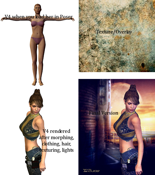
- PAY attention to light and shadows. If the light in your background is coming from the left and your render was rendered with lights coming from the opposite direction including a rendered shadow(s), you should either mirror your image or mirror your background. If there is a ground shadow with your render and it still doesn’t look right, it should be removed. You can paint shadows back in later, on a separate layer.
- DON’T be afraid to change the background. (Always read the terms of use before doing this, especially if you are using free backgrounds, just to be safe.) You can enhance the color and light and shadow in the same way as you do for your render, by duplicating the background layer and playing with layer blending modes. You can change the colors of certain items, or areas of your backgrounds. You can mirror your backgrounds and depending on the background, flip them.
- ADD shadows to anchor the 3D figure to the background. This can be done by painting with a dark color found in the background on a separate layer and playing with opacity until you like it. I like this method because you can paint the shadows for the background and for your figure on the same layer. You can also create shadow by using the burn tool on the actual background. If you use the burn tool, I advise you to go very gently with it at a low opacity and build the shadow up little by little. Don’t forget to darken the part of your 3D figure that is in the shadow, for example the feet. Again do this little by little.
- ADD what is called a texture or overlay on top of your art. These textures are also used by photographers to enhance their photos. This is the quickest way to really make everything come together as both your render and the background will share the colors, shadows and lights introduced by the texture. Once again you will be using the layer blending modes with the texture. Textures can be rough, smooth or a combination and come in various colors. You will learn over time what will work and what doesn’t. It really is all about experimenting and personal artistic taste and style.
- USE 2D elements, brushes and even some cloning in the background behind, and in the foreground over your 3D render, to add depth and really make your 3D figure belong to the background.
When making my digital art named ‘Changes’, I used many of the techniques I mentioned above, including mirroring my render, layer blending modes, texture overlays and 2D elements.
First Steps
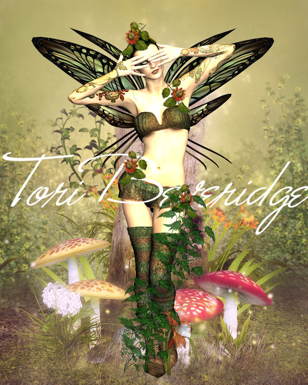
This is what the art looked like during the beginning phases of creating. As you can see, my render and the 2D elements I am using look pasted on to the background.
Next Steps
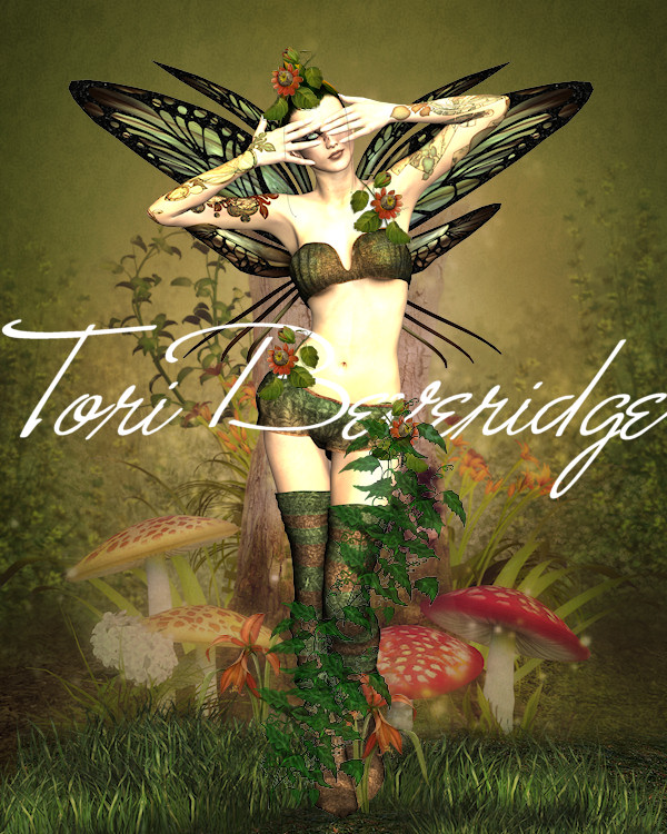
Here I’ve added a texture overlay over the background layer only, to deepen the colors and the shadows in the background. I’ve also added more 2D elements in the form of ground cover and grass. You can see that the fairy is no longer looking like she has been pasted onto the background.
More Steps
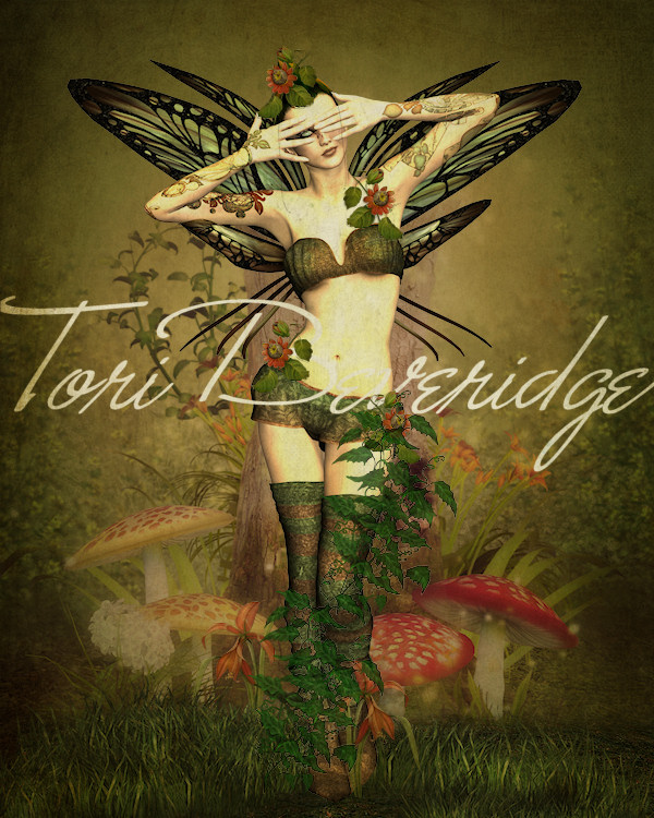
In the next few steps, I added not one but two different texture overlays over the whole image to bring a unity to the art work. I was still not finished and there were many more steps before the art was finished, including the use of a filter.
Completed Art, ‘Changes’
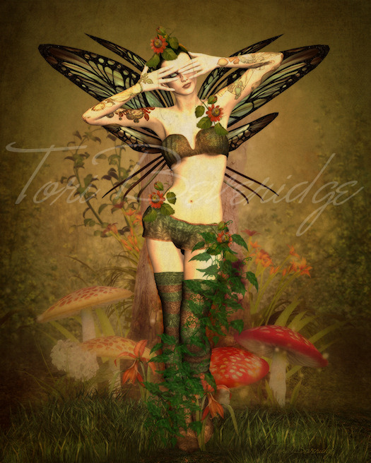
Here is the finished art, Changes
I hope my tips encourage you to experiment and try new techniques in your digital art. Please download this high res texture that I painted using watercolor, then modified in Photoshop. It may be used for both personal and commercial use in your artwork and photography. You may not recolor or resize it and display it or share it as your own. You may not redistribute it alone, or as part of a package, or sell it as your own.
Converted Green Watercolor Texture by Tori Beveridge
You’ll find beautiful backgrounds, textures, and elements in the stores on Renderosity. Here are a few of my favorite vendors (in no particular order) for backgrounds, textures and 2D elements:
If you have any questions, please ask in the comments below and I’ll do my best to answer them.
Have fun creating!

